An aesthetic photo dump is the curated version of the regular one. Same casual premise, except the slides agree with each other. The photos are not better. The range is narrower. Here is what the good ones actually do.
The four things that create the look
- One color range. Pick the direction before you pick photos: warm and cream, cool and grey, or one saturated accent against neutrals. Drop anything that fights it, even if it is your best shot.
- One kind of light. Golden hour, flash at night, or overcast and flat. Mixing harsh midday sun with candlelit interiors breaks a set faster than mismatched color does.
- Alternating distance. Wide, close, wide, close. Twelve portraits in a row is a gallery. Changing scale between slides is what makes a set feel composed.
- Restraint. Eight to twelve slides. What you leave out is what makes this version work.
Sequencing: how to order the slides
- Slide one carries the post. It is the frame the feed opens on, so pick the strongest image rather than the chronologically first one.
- Slides two to four set the palette. Put the most on-theme colors here so the direction is obvious straight away.
- Middle slides hold the details. Hands, food, texture, a bit of text. This is where people slow down.
- End quiet. A window, a road, an empty table. A soft last slide makes a set feel finished rather than cut off.
Six aesthetic dump styles
Film. Grain, soft highlights, a date stamp in the corner, sometimes a whole contact sheet as one slide. Also the most forgiving style, since grain hides bad lighting.
Scrapbook. Photos on paper with tape, stickers, torn edges and handwriting. Reads as the most effort while being the easiest to automate.
Polaroid. White frames, one photo each, a caption written underneath. Works especially well for people and travel sets.
One color. Every slide anchored by the same color, whether red, cream or green. Fastest way to make unrelated photos look like a series.
Black and white. Convert the whole set. Mixed lighting stops mattering and everything coheres instantly. Do not mix with color slides.
Collage grid. Two to four photos per slide instead of one. Fits more of the month into fewer slides and gives each slide its own composition.
One color, three ways
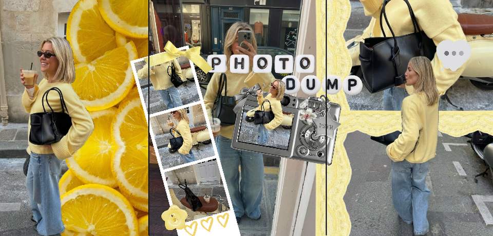
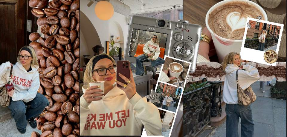
The same idea run through three palettes, each shown open in the editor. The photos share a dominant color, and the stickers and frames pick it up instead of fighting it.

Scrapbook, in practice
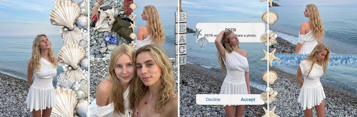
The scrapbook style leans on layers rather than color: cut-out stickers, letter tiles, lace edges, a screenshot dropped on top of a photo. Four slides from one set:
Editing: how far to go
Enough to align the set, not enough to look retouched. In practice that is white balance pushed the same way on every photo, matched contrast, and a little grain across the whole set. Skip skin smoothing and heavy vignettes. The format only works while it still reads as real.
A common shortcut that backfires: applying one strong preset to everything. Photos shot in different light react to the same preset differently, so the set ends up less consistent than before. Match the result, not the settings.
Getting the look without editing twelve photos
Every style above is layout work: frames, tape, handwriting, grids. Doing it by hand in a design app is where most people give up around slide four. PSTR handles that part. Pick photos from your camera roll and the app assembles the slides in one consistent style, then exports them full-resolution at Instagram sizes. Free on the App Store and Google Play, with the AI layout on iPhone for now and the manual editor on Android.
Need themes to shoot for? Browse 30 photo dump ideas, or start from free carousel templates.
FAQ
What makes a photo dump aesthetic?
Consistency rather than quality. A shared color range, a shared kind of light, and slides that alternate between wide shots and details. Ten mediocre photos that agree with each other look better than ten good ones that do not.
Should every photo have the same filter?
Same direction, not the same strength. Push everything toward one temperature, warm or cool, and match the contrast. Applying an identical heavy preset to every shot is what makes a set look templated instead of curated.
What are the most common aesthetic dump styles?
Film with grain and timestamps, scrapbook with tape and handwriting, polaroid frames with captions, one-color sets, and black and white. Pick one per post and commit to it.
How many photos should an aesthetic dump have?
Eight to twelve. Curated sets get worse as they get longer, since the whole premise is that you left things out.
More photo dump guides
- Photo dump: what it is and how to make one
- 30 photo dump ideas
- Which photo dump app you need
- 100+ photo dump captions
By month
- August photo dump ideas
- September photo dump ideas
- October photo dump ideas
- November photo dump ideas
- December photo dump ideas
- January photo dump ideas
By occasion
Make one this week
Pick a color, pick ten photos that agree with it, and post. PSTR is free if you would rather not build the layout yourself.